
The Flexbox's properties and there's values, are:
Properties for the parent class:
Display – By using the display:flex; propertie, we set the container in the flex mode (inline or block – depending of the given value) and also it enables a flex context for all its direct children elements.
Important: the CSS's columns properties/values will not be applied inside a flex container, only the flex properties and their value will be applied:
.container {
Dispay: flex; or inline-flex
}
Values:
So the values of the function are a combination of: flex-direction and flex-wrap:
.container {
Flex-flow: column wrap;
}
Values:
The followings values are not supported by all the browsers yet:
Values:
Values:
Flex Items Properties:
By default, flex items are laid out in the source order (starting with item 0).
However, the order property controls the order in which they appear in the flex container. So the first flex item doesn't have to appear as the first item in the layout: :
div class="flex-container">
div style="order: 3">1 /div>
div style="order: 2">2 /div>
div style="order: 4">3 /div>
div style="order: 1">4 /div>
/div>
This defines the ability for a flex item to grow in the alocated space, if it's necessary.
It accepts a unitless value that serves as a proportion.
It dictates what amount of the available space inside the flex container the item should take up.
In other words, the flex-grow property specifies how much a flex item will grow relative to the rest of the flex items.
If all items have flex-grow set to 1, the remaining space in the container will be distributed equally to all children.
If one of the children has a value of 2, that child would take up twice as much of the space either one of the others (or it will try, at least).
The value must be a number, default value is 0.
Negative numbers are invalid
.item {
flex-grow: 4;// default 0 and we asked the item to be 4 times more then the default value
}
This defines the ability for a flex item to shrink if necessary.
The flex-shrink property specifies how much a flex item will shrink relative to the rest of the flex items.
Negative numbers are invalid.
.item {
flex-shrink: 3; /* default 1 */
}
If we set a global shrink value at all flex items, and we want some item to not shrink, we will select those item and make
'flex-shrink: 0'
The flex-basis property specifies the initial length of a flex item.
This defines the default size of an element before the remaining space is distributed. It can be a length (e.g. 20%, 5rem, etc.) or a keyword. The auto keyword means “look at my width or height property” (which was temporarily done by the main-size keyword until deprecated). The content keyword means “size it based on the item’s content” – this keyword isn’t well supported yet, so it’s hard to test and harder to know what its brethren max-content, min-content, and fit-content do.
.item {
flex-basis: | auto; /* default auto */
}
div class="flex-container">
div>item1/div>
div>item2/div>
div style="flex-basis: 200px">3/div>
div>item4/div>
/div>
If set to 0, the extra space around content isn’t factored in. If set to auto, the extra space is distributed based on its flex-grow value.
This is the shorthand for flex-grow, flex-shrink and flex-basis combined.
The second and third parameters (flex-shrink and flex-basis) are optional.
The default is 0 1 auto , but if you set it with a single number value, like flex: 5;, that changes the flex-basis to 0%, so it’s like setting flex-grow: 5; flex-shrink: 1; flex-basis: 0%;.
.item {
flex: none | [ <'flex-grow'> <'flex-shrink'>? || <'flex-basis'> ]
}
It is recommended that you use this shorthand property rather than set the individual properties. The shorthand sets the other values intelligently.
.
This allows the default alignment (or the one specified by align-items) to be overridden for individual flex items.
The align-self property specifies the alignment for the selected item inside the flex container.
Please see the align-items explanation to understand the available values.
.item {
align-self: auto | flex-start | flex-end | center | baseline | stretch;
}
Note that float, clear and vertical-align have no effect on a flex item.


The CSS Grid's properties and there's values, are:
Properties for the grid conatainer:
Display – Defines the element as a grid container and establishes a new grid formatting context for its contents.
It has the following values:
.container {
Display: grid (generates a block-level grid); or inline-grid (generates an inline-level grid)
}
Values:

Values:
Values:
< grid-row-gap> < grid-column-gap> – length values
.container {
/* standard */
gap: < grid-row-gap> < grid-column-gap>;
/* old */
grid-gap: < grid-row-gap> < grid-column-gap>;
}
Example:
.container {
grid-template-columns: 100px 50px 100px;
grid-template-rows: 80px auto 80px;
gap: 15px 10px;
}
If no row-gap is specified, it’s set to the same value as column-gap.
For exemples visit css-tricks.com
Values:
This behavior can also be set on individual grid items via the justify-self property.
Values:
Values:
Values:
Values:
Values:
Values:
Values:
Values:
Grid Items (Children) Properties:
Determines a grid item’s location within the grid by referring to specific grid lines. grid-column-start/grid-row-start is the line where the item begins, and grid-column-end/grid-row-end is the line where the item ends.
Values:
Shorthand for grid-column-start + grid-column-end, and grid-row-start + grid-row-end, respectively.
Values:
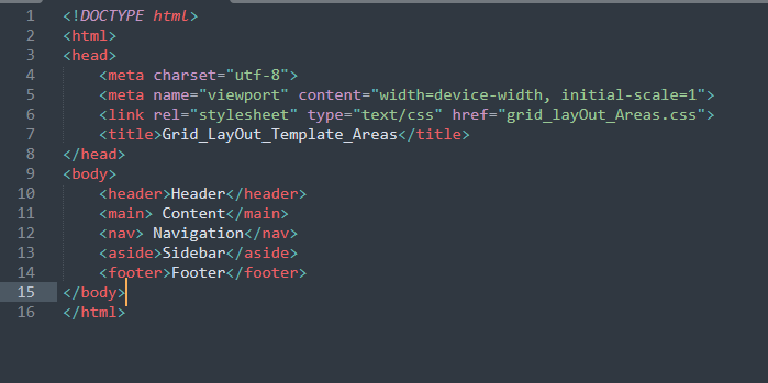
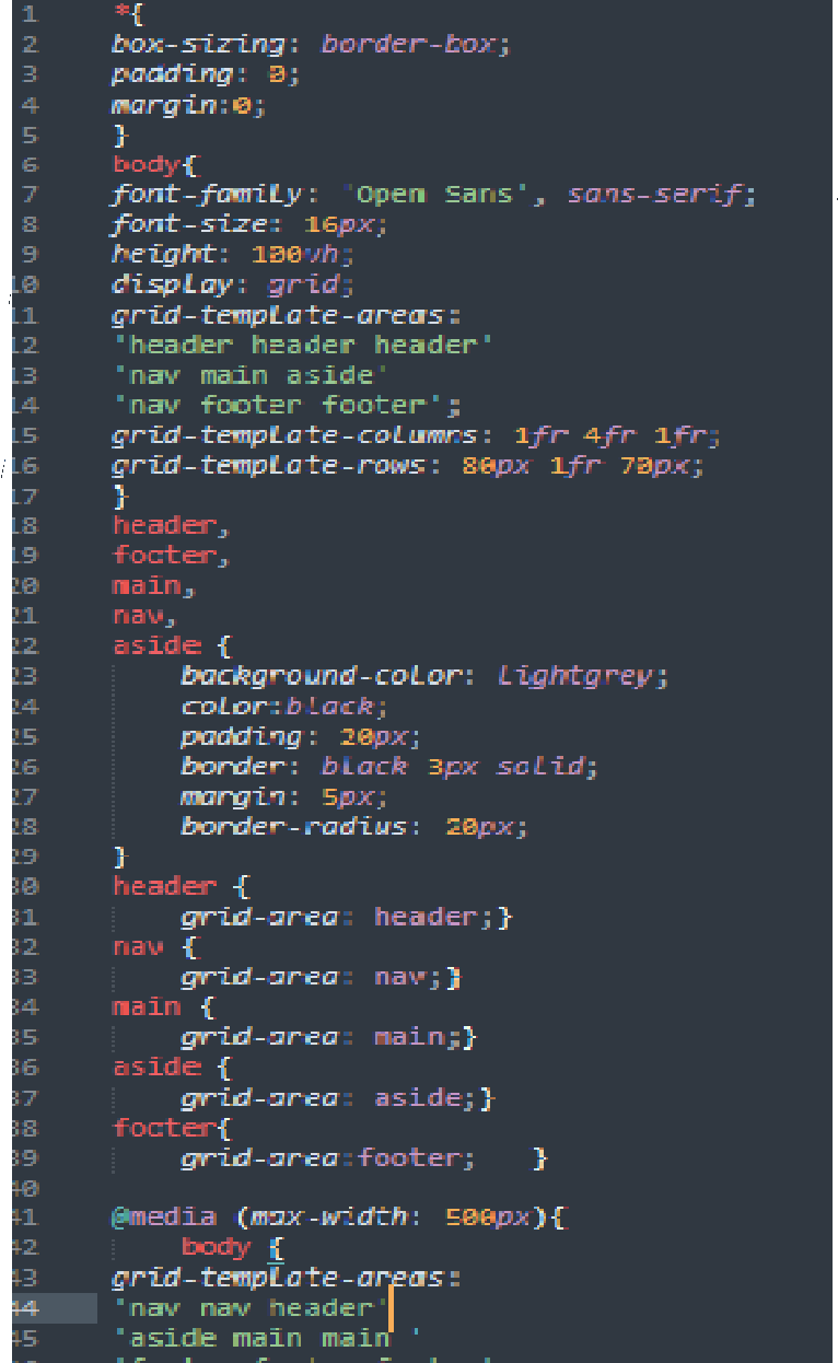
Gives an item a name so that it can be referenced by a template created with the grid-template-areas property. Alternatively, this property can be used as an even shorter shorthand for grid-row-start + grid-column-start + grid-row-end + grid-column-end.
Values:
Examples:
As a way to assign a name to the item:
.item-a {
grid-area: header;
}
As the short-shorthand for:
grid-row-start + grid-column-start + grid-row-end + grid-column-end:
.item-a {
grid-area: 1 / col4-start / last-line / 6;
}

Aligns a grid item inside a cell along the inline (row) axis (as opposed to align-self which aligns along the block (column) axis). This value applies to a grid item inside a single cell.
Values:
To set alignment for all the items in a grid, this behavior can also be set on the grid
container via the justify-items property.

Aligns a grid item inside a cell along the block (column) axis (as opposed to justify-self which aligns along the inline (row) axis). This value applies to the content inside a single grid item.
Values:
To set alignment for all the items in a grid, this behavior can also be set on the grid
container via the justify-items property.
Examples:
.item-a {
align-self: center;
}

Exemples may be found here...
place-self sets both the align-self and justify-self properties in a single declaration.
Values: